Cyber Security
Brand Identity & Art Direction
Intact Insurance
Design Development
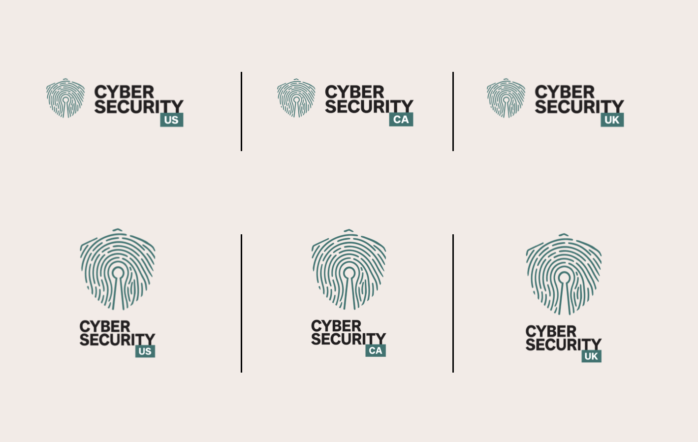
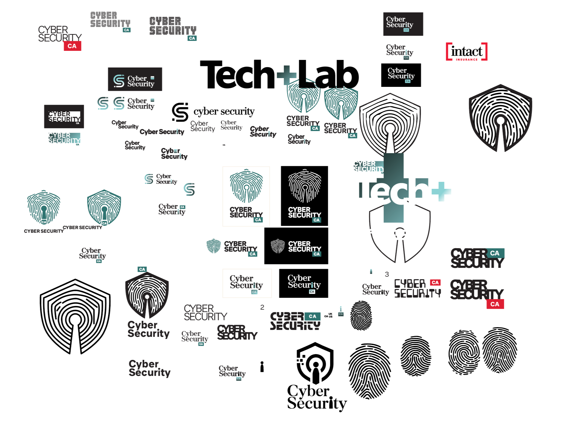
The concept evolved into a refined fingerprint-inspired mark paired with bold typography and a restrained colour palette. I explored horizontal and stacked compositions, light and dark variations, and optional country identifiers to create a consistent yet adaptable identity.
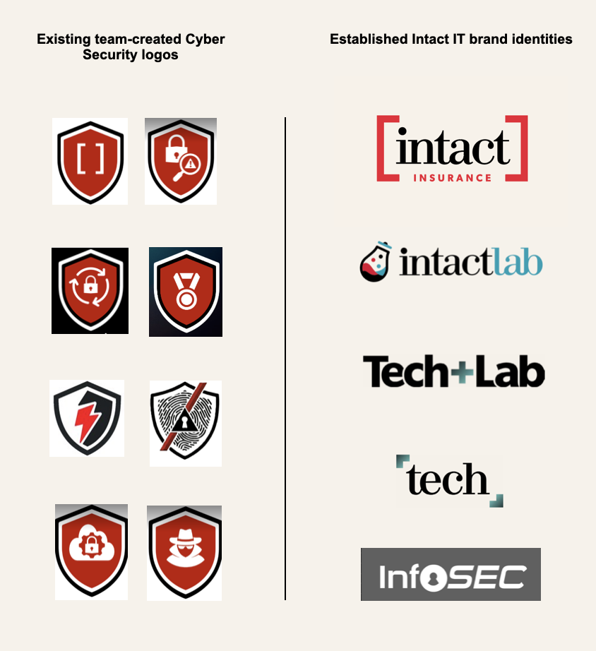
Developed for Intact Insurance, this project aimed to create a unified visual identity for its global Cyber Security team. The challenge was to establish a distinctive, recognizable brand that aligned with Intact’s visual language while allowing flexibility across different regions.
The Concept
The idea began with a simple connection between identity and protection. A fingerprint represents individuality and authentication, while a keyhole symbolizes privacy and secure access. By combining these two elements, I created a visual symbol that communicates the human side of digital security.
Final Identity
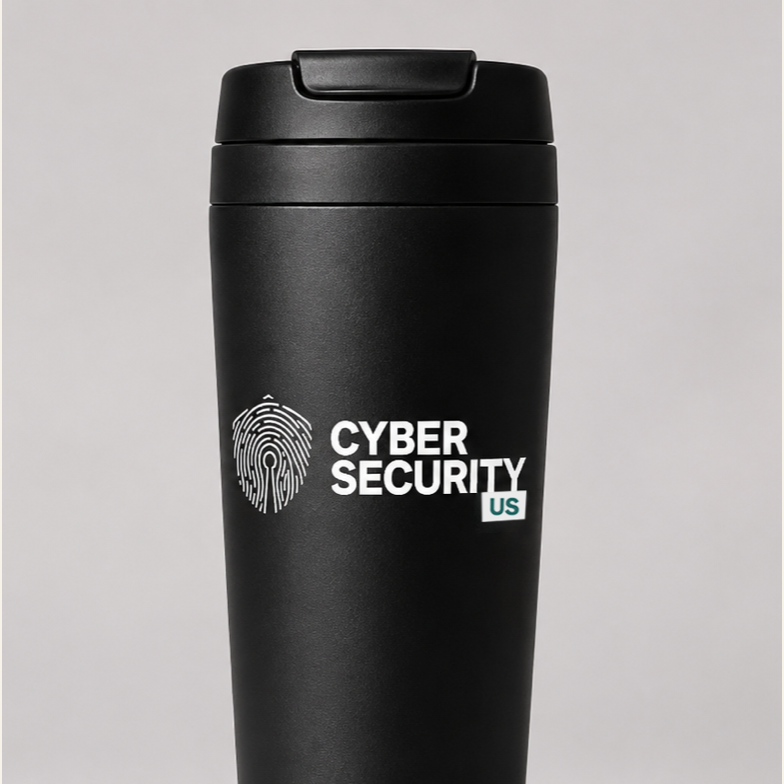
The final proposal brings together a recognizable symbol, clear typography and a flexible logo system. Its application across digital communications and branded merchandise demonstrates how a single creative concept can extend into a cohesive visual experience.
Through concept development, visual exploration and brand system design, the project reflects my approach to art direction: transforming a strategic idea into a clear, meaningful and adaptable visual identity.